FTable
Mobile app · Case study
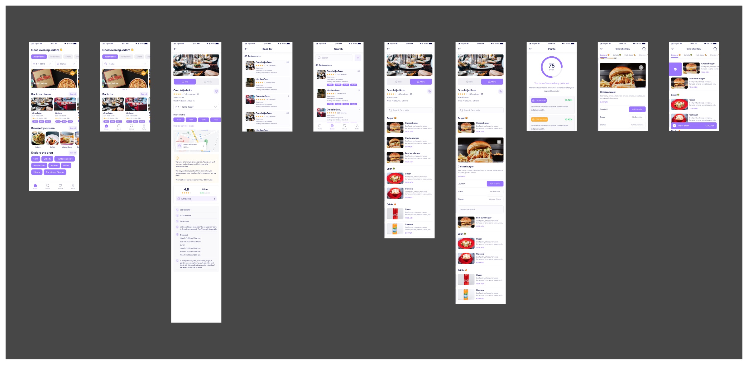
FTable is a table reservation app for restaurants in Baku. You pick a party size and time, find a place with a free slot, book it, and can add dishes from the menu before you arrive. I designed the flow from the home screen to the order.
01Overview
Time slots first, everything else second
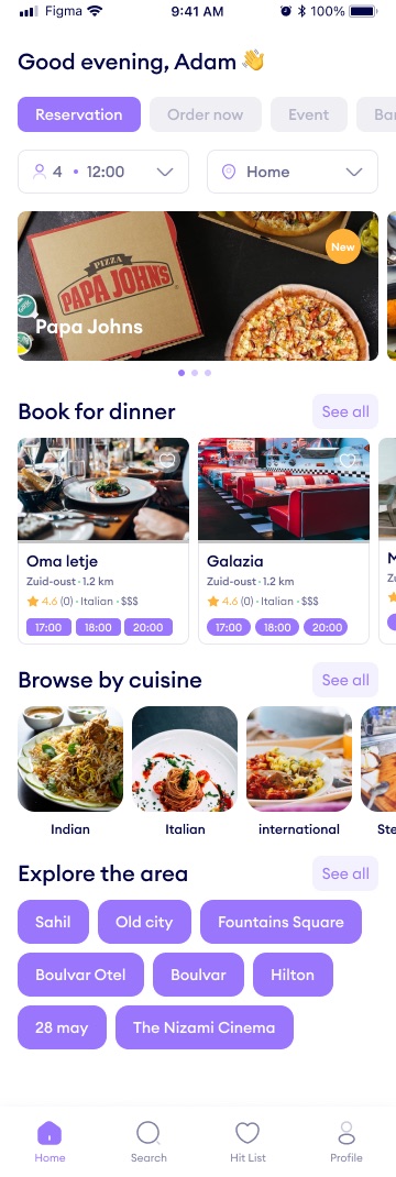
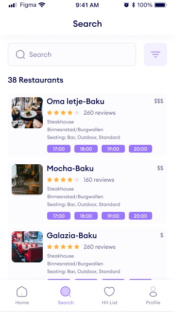
The question behind a reservation is "where can four of us eat at eight?". So party size and time sit at the top of the home screen, and almost every restaurant card, on home and in search results, ends in a row of bookable time slots.
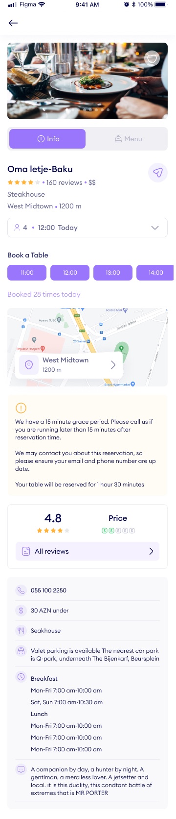
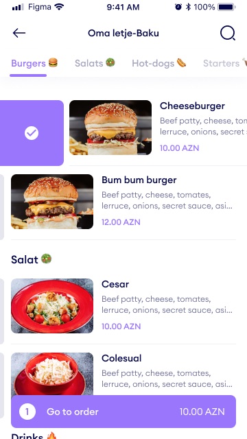
A restaurant page splits into Info and Menu tabs. Info is for deciding and booking; Menu lets you add dishes to an order, which then follows you as a bar at the bottom of the screen.
02What I designed
Find, book, pre-order
- HomeParty size, time and area up front
Tabs for Reservation, Order now and Event, then "Book for dinner" cards, cuisines and neighbourhood chips.
- SearchA list built around availability
Each result shows rating, cuisine, area, seating types, price level and the next free times.
- RestaurantInfo tab with booking
Time slots, how many times it was booked today, a map, the house rules for lateness, reviews, contacts and opening hours.
- MenuDishes that expand in place
Tapping a dish opens it inline with quantity, extras and a comment, and "Add to order".
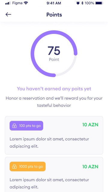
- PointsA reward for showing up
A ring shows points earned for honoured reservations, with rewards that unlock at set thresholds.
03Screens
From home to the order

- Add client and year to the header line (currently "Mobile app · Case study").
- The reward descriptions on the Points screen and some restaurant text are placeholder; the case study does not describe that copy.
- Confirm your role and whether the app shipped. The "Order now" and "Event" tabs on home are not designed in this section, so they are only mentioned.