Tentony
Mobile app · Case study
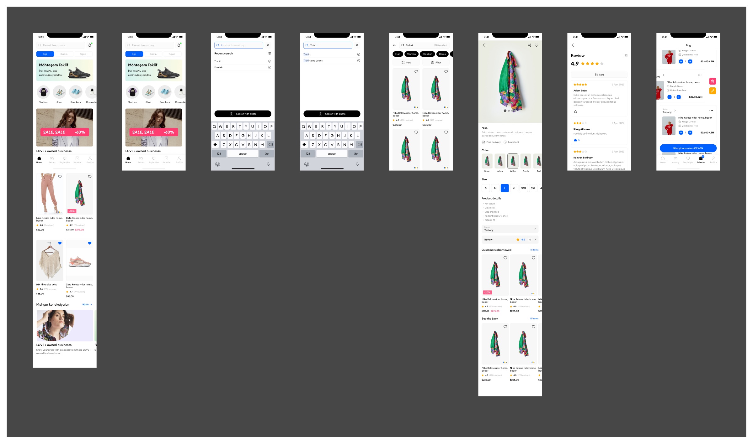
Tentony is a mobile shopping app for clothes, shoes and cosmetics, written in Azerbaijani. I designed the core buying path: home feed, search, results, the product page, reviews and the bag.
01Overview
A clean storefront that gets out of the product's way
The screens are white and mostly typographic, with one blue for selection and action and pink reserved for discounts. Product photos sit on light grey cards so items from different sellers still look like one catalogue.
The flow is the familiar one, kept short: browse or search, open a product, pick colour and size, check reviews, then finish the order from the bag.
02What I designed
Five screens along one path
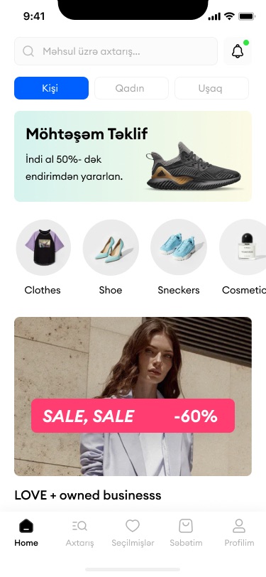
- HomeAudience tabs, offers and categories
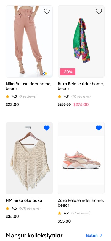
Kişi, Qadın and Uşaq switch the whole feed; a promo banner, round category shortcuts and a sale card sit above the product grid.
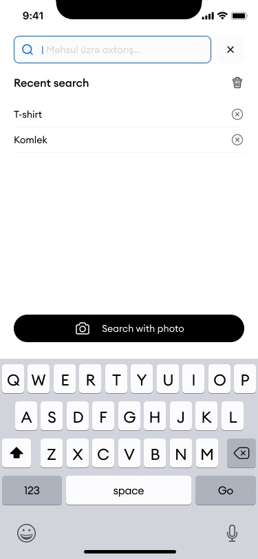
- SearchRecent queries, suggestions and photo search
Recent searches can be cleared one by one, typed text is matched in the suggestions, and "Search with photo" stays above the keyboard.
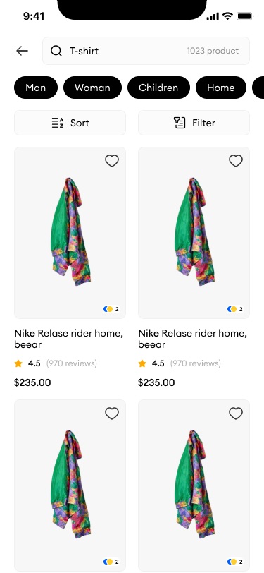
- ResultsProduct count, category chips, sort and filter
Two-column cards show brand, name, rating with review count, price and available colours.
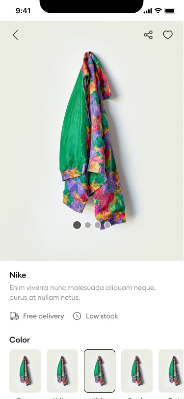
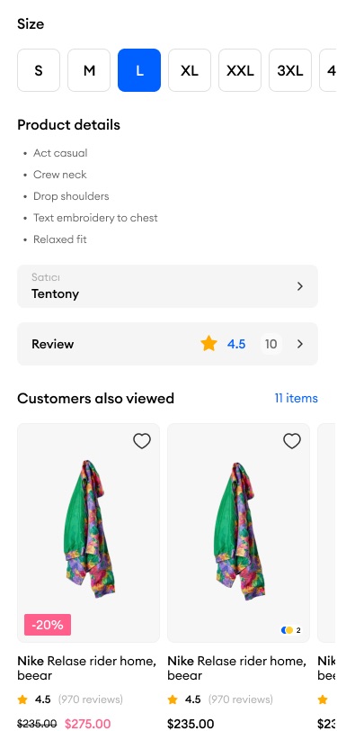
- ProductGallery, colour and size, details and seller
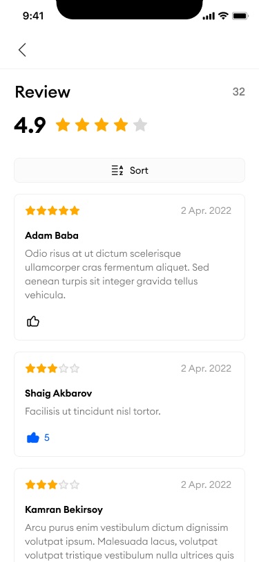
Delivery and stock status sit right under the name; the seller, reviews, "Customers also viewed" and "Buy the Look" follow below.
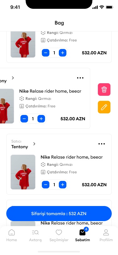
- BagItems grouped by seller, with swipe actions
Each line has quantity steppers and price; swiping reveals delete and edit, and the checkout button shows the total.
03Screens
From the home feed to the bag
- Add client and year to the header line; no context was available.
- "Tentony" appears in the design as a seller name. Confirm whether it is the app/marketplace name or one seller.
- Product descriptions and reviews use placeholder text and repeated product names; the page only describes structure.
- Skipped the "T-shi" suggestion state (near-duplicate of the search screen).
- Confirm your role and whether it shipped.