Hive
Digitalks · Landing page · 2022 · Case study
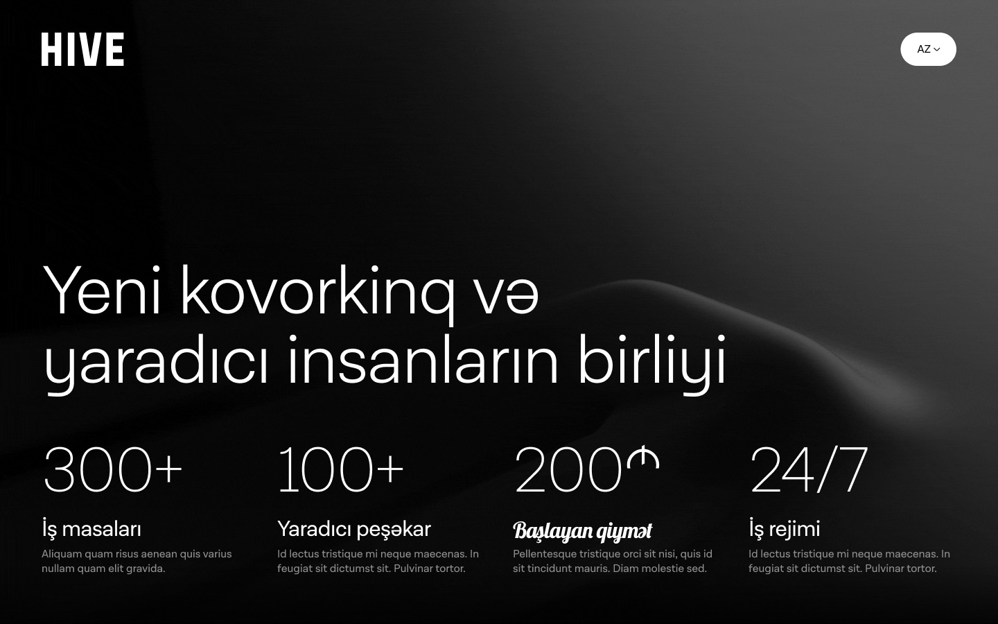
Hive is a coworking space in Baku that sells itself as a community for creative people. I designed its Azerbaijani landing page: one long scroll that explains the space and ends in a membership application.
01Overview
A brand-led page for a space, not a product
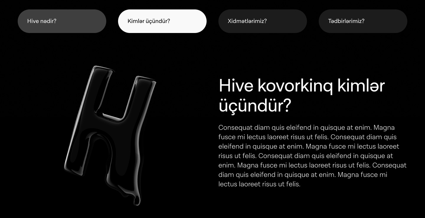
A coworking space sells a feeling as much as desks. The page leans on a black, editorial look: a large light-weight headline, a glossy liquid "H" that drips into the next section, and a single wide interior photo near the end.
Underneath the styling it answers the questions a visitor actually has, in order: how big is it, who is it for, what do I get, and how do I join.
02What I designed
Four blocks, read top to bottom
- HeroHeadline and four numbers
Desks, members, starting price and hours: the facts people compare spaces on, visible before scrolling.
- AboutTabbed content
"What is Hive", "Who is it for", "Services" and "Events" share one panel, so the page stays short.
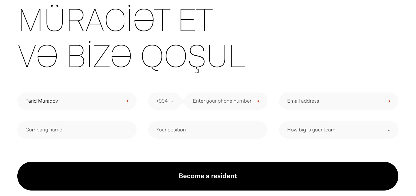
- ApplicationSix-field form
Name, phone with country code, email, company, position and team size. The first three are required.
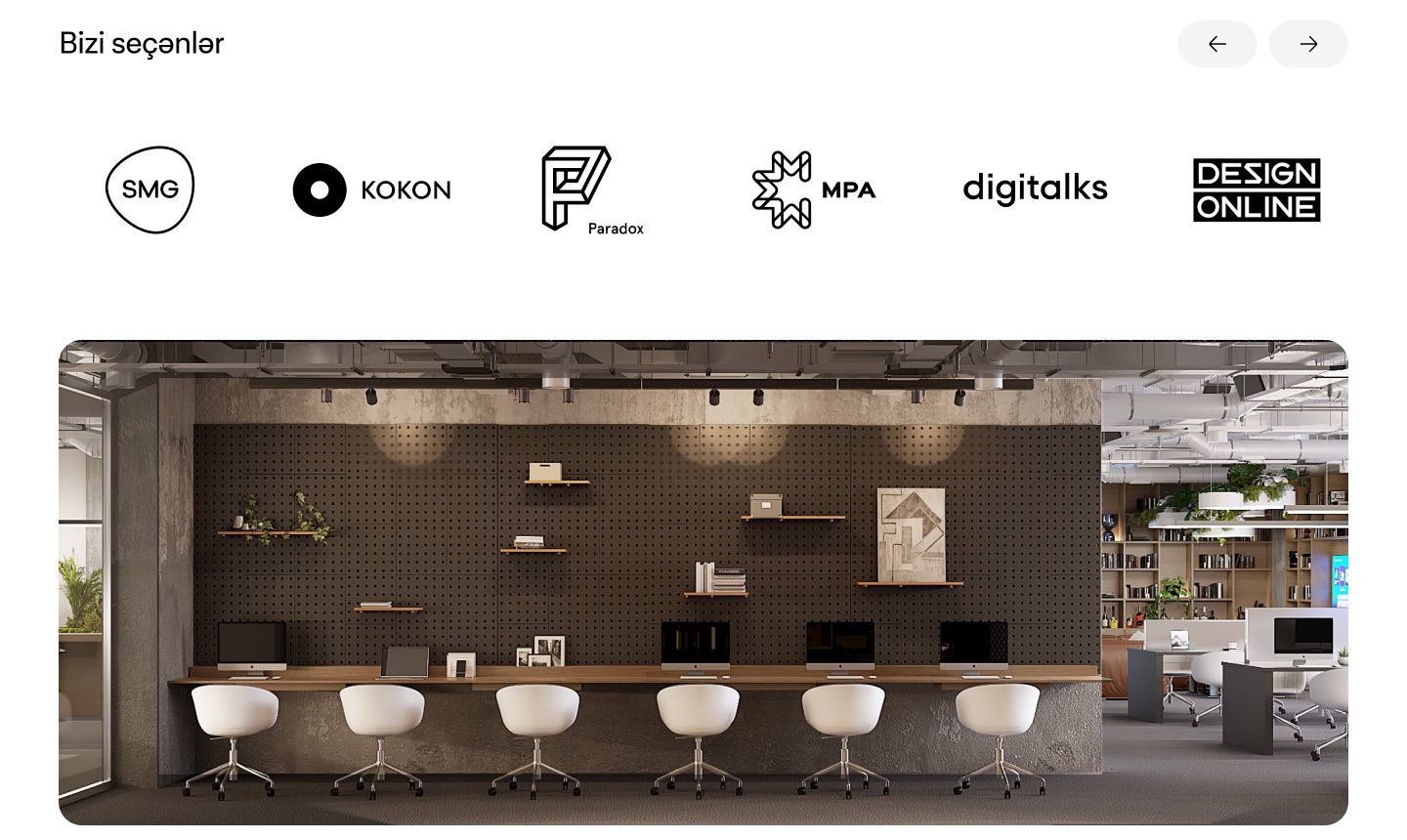
- Proof"Bizi seçənlər" logo carousel
Companies already working there, followed by a photo of the space.
- FooterContacts and address
Email, phone, the Sabah Residence address and social links.
03Screens
The page, section by section
- Several paragraphs in the design are still placeholder text; the case study only describes structure, not copy.
- Confirm whether the page shipped and whether you also designed the 3D "H" and brand, or only the page.